by Brendan Stone and Tom Fletcher
What we made
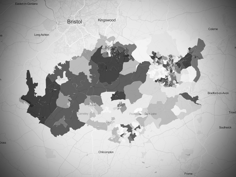
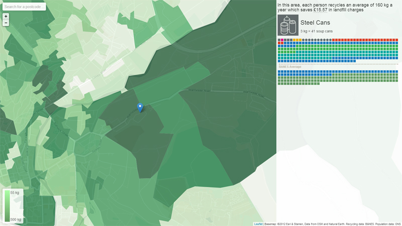
We made an interactive map displaying rates of recycling in BANES.
Why we made it
We wanted to see if there were any obvious trends or patterns in the recycling data as well as to breakdown and display this data in an attractive and easy to understand way which would hopefully encourage people to recycle even more!
How we made it
We used an open source GIS stack starting with QGIS to spatialise, analyse and combine recycling, postcode and ONS census datasets. The results were then stored in a PostGIS database which was served up by Geoserver to be consumed by a Leaflet.js map embedded in an a webpage built with AngularJS.
What was hard
The most difficult part was coming up with a method to accurately distribute the total amount of recycling recorded at route level to smaller geographies which could be displayed and mean something to people.
One improvement to the data could be to increase the granularity at which it is recorded. Perhaps record the amount and type of recyclable at route or even sub-route level to allow more detailed and precise analysis to be conducted.
How we’d develop it
Further developments could involve pulling in and displaying more demographic and census data to look for trends, as well as incorporating more info about the amount and type of recyclable material sent to landfill, as well as year on year & area comparisons plus route/collection day information.
Team
Demo site at nadnerb.co.uk/bathhacked