Jurnyz by Simon Starr, Jordan Elver and Liam Richardson takes a different look at air quality by helping people understand how their own behaviour affects pollution.
What we made
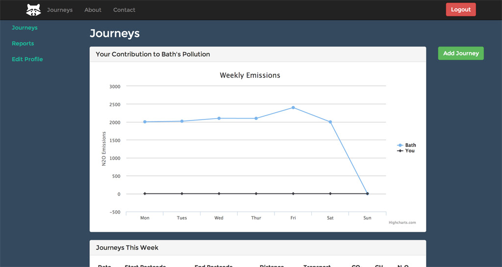
Jurnyz is a web app that records the transport behavior of its users, and compares the amount of pollutants they produce to the live results from Bath. We hope recording and graphing this data will encourage users to change their attitude to the journeys they make, and seek out less pouting modes of transport. The version finished on the day allows users to sign up and edit their profile, add journeys they make, and see their weekly contribution to live data form the measuring stations around Bath.
Users enter their start and end points, the date of their journey and the mode of transport used. These include petrol, diesel and hybrid cars, public transport options such as trains and buses, as well as walking and cycling. The average emissions for that journey are calculated then plotted on a graph with the other journeys from that week. The same graph also contains live data from Bath, so the user can see their own contribution to Baths total pollutants.
Why we made it
The idea came about from a project involving recycling in the US, where houses where given 3 types of leaflets. “Recyling will save you money”, “Recyling will save the environment” and “Your neighbors are recycling, are you?” It was only the 3rd leaflet that had an effect on recycling levels. The app uses the same approach to encourage users to produce less pollutants then others, by comparing their emissions to their piers and those in the local area.
How we made it
The application is a Ruby on Rails App, that has a basic sign up process and user area and dashboard. When a journey is created, start and end points are entered as postcodes, and mode of transport is chosen from a pre-determined list for which average emission data was available. Googles Distance and Geocode API’s are used to work out how far was traveled, and calculates the emissions based on the transport type. The Highcharts JS library is used to visualise this data in the form of a line graph with two sources, the users and live data form the Bath datasets. The rest of the front end is based on Bootstrap with a customised skin, freely availably Google fonts, and the icons are from Font Awesome.
How we’d develop it further
We started working on the next key feature which would be to compare your journeys against your friends, but didn’t have time to finish it on the the day. Other planned features include the ability to set up regular journeys such as a commute to work, more advanced data anaylisis, and better visualisations to aid user understanding of their emissions, and advice on how this could be reduced.
Jurnyz can be found online at jurnyz.com, on Twitter at @jurnyz, and on github at github.com/sstarr/journeyapp.