In our last post we explored when Strava users are active in Bath. The natural next step in our exploration of the Strava Metro data for Bath is to look at where they are moving through the city.
Exploring the spatial aspects of the data can potentially help us understand how cyclists use the transport network and whether there are any congested areas. The following few maps show a variety of ways in which we can visualise the data. You can click on the images to load a larger version.
Cyclists and cycle paths
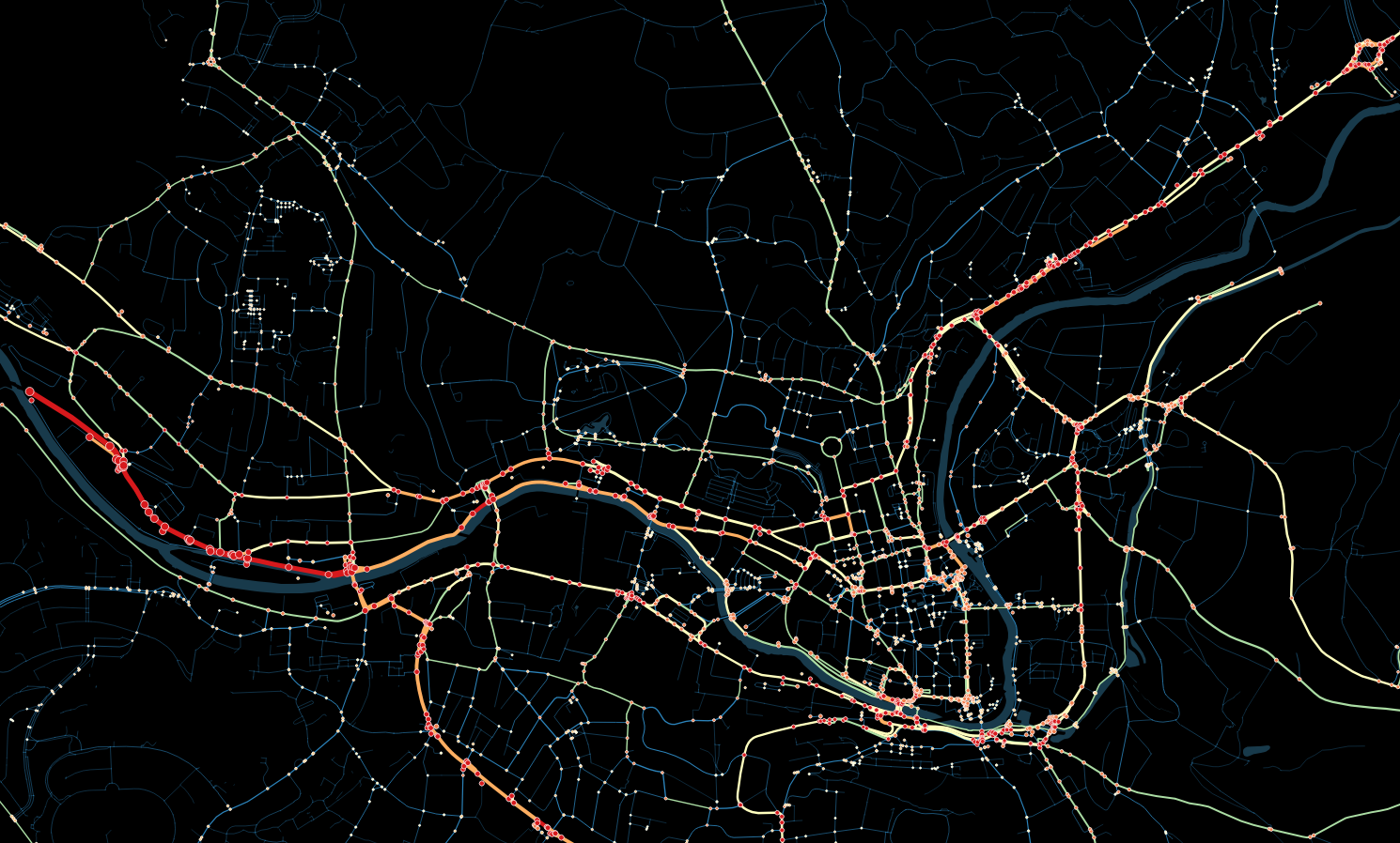
On the following map the intensity of the hexagons reflect the number of Strava users moving through that location during 2015. So the whiter the hexagon, the busier that stretch of road or cycle way. The dotted red line on the map is the local cycle network, taken from Open Street Map.
Note: The empty black areas indicate areas where we don’t have any data. So for example the lack of activity on the cycle path in the top-right doesn’t mean that its not being used. Its just an artefact of the coverage of the data. Additionally, there is no data for portions of routes which pass through tunnels e.g The Two Tunnels, due lack of GPS coverage.
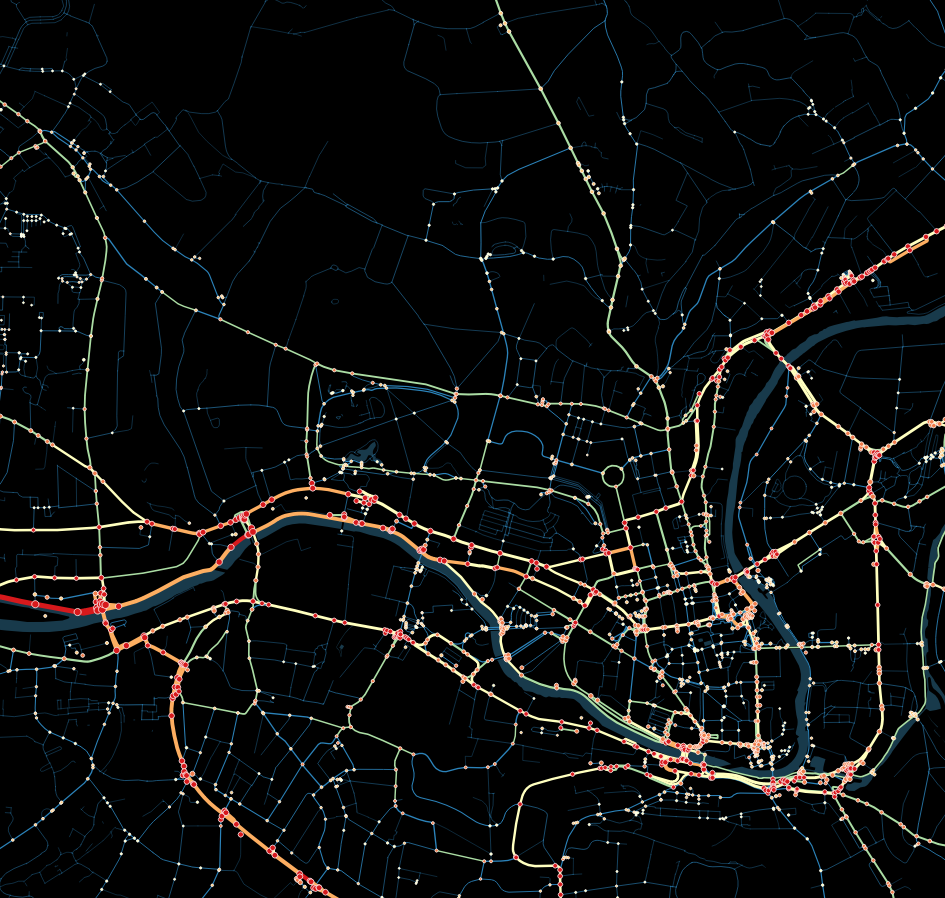
Cycle ways and intersections
The next map tries to highlight not just the busy sections of road and cycle ways, but also the busy intersections and junctions.
The lines on the map are colour coded and sized based on how many cycling activities were recorded in that location. Thicker, redder roads and cycle ways are busier. Thinner, greener lines are quieter.
The dots on the map indicate intersections. Larger dots indicate more cyclists were present at that junction.
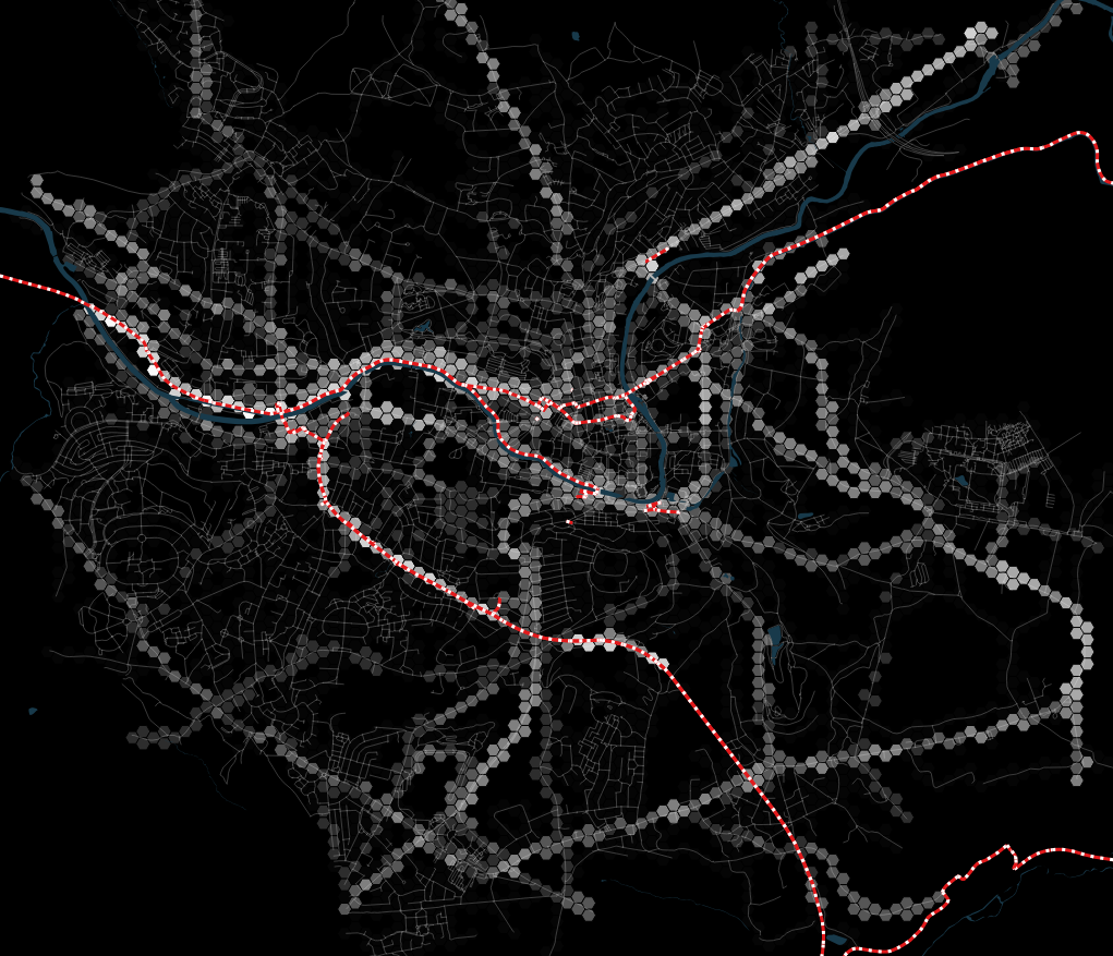
Our final map tries to combine some of this information together. Again the dotted line indicates the cycle paths.
The hexagons mark areas of activity. Busy areas are shown with stacked hexagons.
To remove some of the clutter, the areas of the city with very little activity have been excluded from the map allowing us to focus on the busier areas:

All three of these maps clearly indicate how well used the existing cycle and road network is around the city.
What insight can you draw from the maps? Do they prompt further questions? We’d be interested to know your thoughts, so please leave us a comment below.
In our next post we’ll be showing some animated maps that bring both the geographic and time series data to life.
We’d like to thank Strava for the opportunity to work with a sample of their Metro dataset. It’s a fantastic insight into cycling activity around the city.
March 17, 2016 at 11:37 am
That’s lots of my data 🙂
I use Strava for almost every trip, including to the shops and back, but I’m pretty unique in that respect I suspect – most Strava users and ‘sports’ cyclists, tracking their miles (or rather kilometres, most of us measure our rides in km, they sound more impressive!!) rides and routes as training rides more than ‘utility’ cyclists (who, I’d suggest, would be less confident and more inclined to keep off busy roads).
It’s great data still and really interesting to see it presented in this way! Thanks for the effort you’ve put into this!
March 17, 2016 at 7:36 pm
Hey Andy I actually think you would be very suprised by who all uses Strava and for what purposes. We see commute rates as high as 87% of all trips in and around London. Most Strava users are just bike riders who love to ride bikes. They track it all beccause its actually cool. The power of the Metro format is the ability to ingnore the rec rides and focus on commute (or the other way).
March 17, 2016 at 7:38 pm
On other note is that is the Open Street Map did not have the raod/path geometery in place then Strava cannot match it. I would be interested in seeing if the dark bike bath tin the upper right is correctly mapped in OSM. If you can send me the URL I will check iD.
March 17, 2016 at 7:40 pm
aaaah nevermind it is because the road network is clipped to the boundary of the polygon you provided.