The Guardian have just published an interesting article highlighting how many cities are beginning to tap into the cycling data provided by Strava Metro. We’ve been working with that data for the last few months and are pleased to announce our latest interactive tool.
You can catch up on our project via this series of blog posts which describes our journey exploring the data for Bath. The posts include some initial analysis of the data as well as a variety of maps & videos.
To build on this further, we asked the cycling community for feedback about what else we could do with the data. Many of the suggestions we received were focused on specific areas of the city so we have looked for a way to provide some more detail and interactivity.
Strava have kindly agreed to let us release an interactive map of the athlete data, rolled-up as totals and averages across 2015. This provides a way to drill into many aspects of the data down to the individual street level.
You can now view the interactive map or read on for more detail.
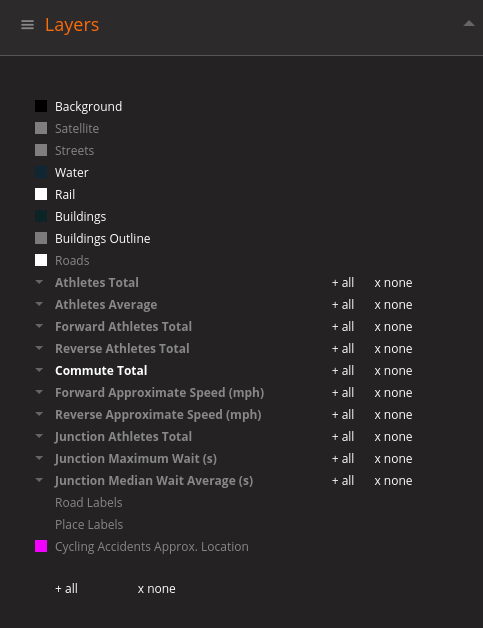
What the map includes
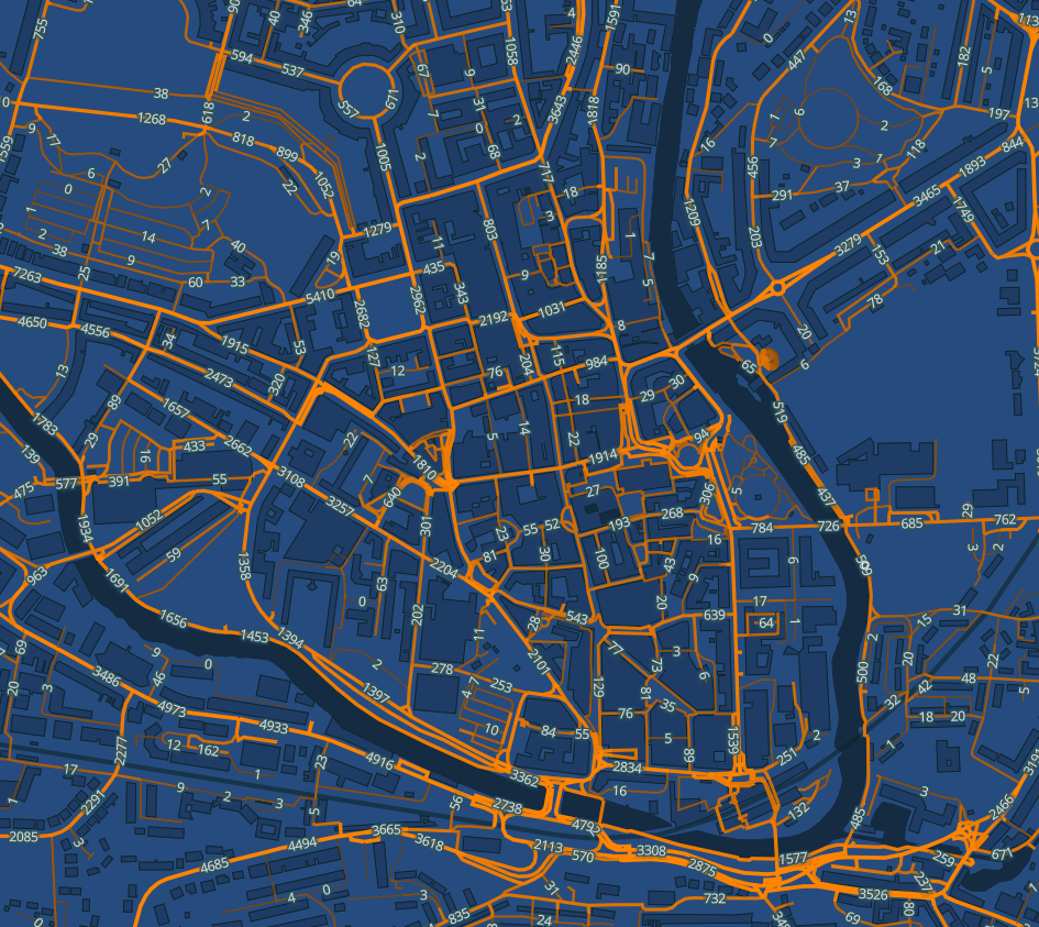
Firstly, while the interactive map includes geographic features for the surrounding area, the Strava Metro data we have access to is limited to the City of Bath.
Secondly, the tool consists of groups of data layers that each visualise different aspects of the dataset. For example the Athletes Total group collects together a set of layers that show the number of athletes that have recorded a journey on specific parts of the map. One layer shows areas that have been logged by 7-16 athletes, while another shows those routes that have been logged by over 4000 athletes. Together they provide a picture across the city. Individually they can provide context on individual areas.
The data layers can be turned on or off individually or as a group, making it easier to focus on specific data points. Each group also has a label layer which shows some numeric data. Some groups, e.g. those that show speeds, also have a direction layer that shows the direction of travel.
The data layers are either attached to edges or nodes on the map. Edges are portions of routes between junctions. Nodes correspond to junctions where edges meet. Roughly speaking: edges are roads and nodes are junctions.
Unless otherwise stated, colours have been allocated to represent the same number of edges or nodes. This is known as quantile categorisation.
The following layers are included in the tool:
- Base layers – A coloured background, Mapbox streets & Mapbox satellite layer (which is unfortunately a little bit cloudy lately).
- Geographic layers – Water, rail, buildings, building outlines, road labels & place labels.
- Athletes Total – The total number of athletes travelling along each edge during 2015. Edges are coloured from red (low total) to blue (high total), with the thickness also increasing with total.
- Athletes Average – The average number of athletes travelling along each edge. The average is calculated across the number of data points rather than time to give a sense of which edges are generally more occupied/busy. Colouring and width are similar to Athletes Total.
- Forward/Reverse Athletes Total – The total number of athletes travelling in one direction along an edge (forward) and travelling in the opposite direction (reverse).
- Commute Total – The number of athletes passing through each edge, where the journey is identified as a commute. Thinner, darker edges have a lower total; thicker, brighter edges have a higher total.
- Forward/Reverse Approximate Speed – A very approximate average speed (in mph) along each edge, in both directions, based on the average time taken to traverse the length of each. Redder is slower, greener faster. Colours are grouped into equal intervals.
- Junction Athletes Total – The total number of athletes crossing each junction (node). Redder, smaller nodes have a lower total; bigger, greener nodes have a higher total.
- Junction Maximum Wait – The longest wait, less than 15 minutes, at each node during the entire year, in seconds. Waits longer than 15 minutes have been suppressed to account for cyclists pausing their journey for very long periods, for example stopping for a coffee in Kingsmead Square. Even so, this is mainly useful for seeing where cyclists seem to spend longer. Colouring as Junction Athletes Total.
- Junction Median Wait Average – The average wait time at each junction in seconds. Colouring as Junction Athletes Total. (For stats wonks: Wait time is recorded as a median wait time on a per minute basis – we take a mean average across all data points for each node.)
- Cycling Accidents Approx. Location – A separate dataset from the Department for Transport which records road accidents from 2005 to 2014. Accidents involving a bicycle have been extracted & presented in this layer. Locations are approximate.

How to explore the map
Our interactive map is built using Mapbox GL JS. In order to use the map, your browser & device will need to support WebGL graphics. Most modern browsers & devices will support this.
Zoom: The map can be zoomed using your mousewheel, using the + & – buttons in the top right or by pinching in or out on a touch device.
Panning: pan the map around by clicking & dragging with your mouse or dragging your finger on a touch device.
Rotate: you can rotate the map by holding the right mouse button while dragging your mouse or by using 2 fingers on a touch device.
Tilt: you may also tilt the map in 3 dimensions by using SHIFT+UP/DOWN on your keyboard. Rotation can be reset by clicking the compass button.
Additional controls for the map can be found in a series of panels by clicking + in the top left. Panels can be shown/hidden by clicking their title.
Show/Hide Layers: In the Layers panel, you can show/hide individual layers by clicking their title. A group of layers can be shown by clicking + all or hidden by clicking x none. All layers can be shown/hidden by using + all or x none below the layer list.
For some of the layers you may click on the map to reveal more detailed information about any features below where you click. This information will be appear in the Features panel.
Within the Themes panel you can choose between a few colour themes for the map.
Waypoints: You can select a series of waypoints on the map which will allow you to bookmark locations or to create a fly-through between the points. A set of sample points has been included.
Controls for manipulating waypoints can be found behind the signpost icon in the bottom left. They follow the familiar video control metaphor, with the X button removing all waypoints.
To add a waypoint, pan & zoom the map to a location and click the “record” button. In addition to the controls, you may fly to, name and remove individual waypoints in the Waypoints control panel.
You may also save/load data for the waypoints under Advanced.
Interpreting the data
While the data are based on real world events, they are also prone to real world problems. Riders stopping to grab shopping can impact wait times. An extreme, localised event may impact yearly totals & averages. GPS inaccuracy can lead to allocation “leakage” into nearby features (see Pulteney Maze or London Rd petrol station).
The best way to use the map is to look for qualitative insights.
- Are there more riders in one area than another?
- Can we identify common routes or bottlenecks?
- Would new infrastructure be valuable in a particular area?
- Are riders using their own shortcuts rather than cycling routes?
- Where might I attract more cyclists to a new coffee shop?
As with any real world data there are inaccuracies, approximations and assumptions. Your mission, should you accept it, is to see past the detail & find something interesting!
Once you find something interesting, please tell us about it
Having access to Bath’s Strava Metro data is a unique opportunity to improve cycling in the city. If you glean any insights from our map or other visualisations please share them with us, either in the comments or via email. If you’ve spotted something but want us to look at the data differently or in more detail, please let us know.
We’d like to thank Strava for the opportunity to work with a sample of their Metro dataset. It’s a fantastic insight into cycling activity around the city.