Yesterday we looked at some maps of the Strava Metro data for Bath. Different types of visualisations can help bring out different aspects of a dataset. So today in our attempt to find useful ways to explore the data, we’ve produced some animated maps.
Completing the first phase of our exploration of the Strava Metro data for Bath we’ve produced some short videos that try to visualise both the spatial and time dimensions of the data.
Tip: some of the videos are quite short. You can use the YouTube controls to pause, rewind and skip to particular points. Also, in the settings menu (the cog icon) you can change the playback speed.
A year of activity
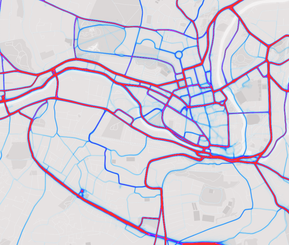
The first video shows a day by day animation of activity in the city. The lines show the road or cycle ways in which activity took place on that day. Thicker, brighter lines are busier.
June 11th 2015 was a big day for cycling in Bath. The Pearl Izumi Tour Series finished in Bath and there were some support races during the day.
Here’s a short video that animates the data for just that day:
Were there other mass cycling events in 2015 which we should visualise?
Visualising busy junctions
One aspect of the data that we’ve not explored so far are the wait times associated with each junction. The following video shows another play through of the whole dataset, but focuses purely on junctions.
Each dot is sized based on the number of Strava users passing through that junction. The colour coding indicates the average wait time. Green is the shortest and red the longest.
Activity by day of the week
The final video, which is also set to music also shows a heatmap of activity. However rather than playing through the dataset day by day, it looks at activities by time of day. This one really highlights the rhythm of life in the city.
Next steps
This completes our initial pass through the Strava Metro data. As this point we’d like to hear further from the local community.
What conclusions do you think we could draw from the visualisations so far? Let’s discuss the findings.
Are there questions you’d like to ask of the data? What else could we investigate in the data?
Let us know what you think!
We’d like to thank Strava for the opportunity to work with a sample of their Metro dataset. It’s a fantastic insight into cycling activity around the city.
March 18, 2016 at 8:45 am
Bike Bath on July 5th 2015 would be interesting. I think a lot of people cycled to the start at the rec.
March 18, 2016 at 3:41 pm
Can you clarify what you mean by ‘junction’ as I’m surprised to see lots of dots along Linear Park/Two Tunnels? Many stop at the Two Tunnels statues for a leisure break. Is this riders coming to an actual stop or just slowing down?
March 22, 2016 at 9:05 am
The Strava data refers to “nodes” these are any intersections and/or junctions between roads, cycleways, paths, etc that are evident on the underlying base map.
So I would expect some nodes on linear park as there are a number of places that paths, etc intersect with it. There’s an intersection at the statues for example.
For each of those nodes they report the wait time. You’re right that this could include rest stops. This is where local knowledge is important to interpreting the data.
March 22, 2016 at 9:14 am
I would be interested to see if the statement that Strava made about “nearly one-half of all rides on Strava in denser metro areas are commutes” is true by looking at the data. If you stripped out known events and areas for the more keen cyclists in the area (Odd Down Circuit, for example), I wonder what remains? Does the statement hold true for cities such as Bath, is it based on the average for the country where places like London would skew the overall result of the data, or is it something else entirely?
March 22, 2016 at 9:21 am
The 54% commute count we reported in the first article comes from the summary of the Bath data, so its not a national average.
In the activity breakdown chart in an early post, that was based on time of day rather than the commute flag. So that also helps confirm large amounts of activity during commuting times.
March 22, 2016 at 9:02 pm
Hey Jack actually areas like London are much closer to 89% of all trips are commutes. I would say on a global level the average (regardless of urban or not) is around 60 – 40%. This is because the Strava user is very engaged in the community that we are building and they just upload everything. They just love to ride bikes and be part of the Metro program.